The Challenge
Jaama are a leading provider of fleet, leasing, and rental management software, trusted by major organisations across the UK. But while their software was forward thinking, their brand identity wasn’t keeping pace. In a sector full of cold, tech heavy competitors, Jaama risked blending in.
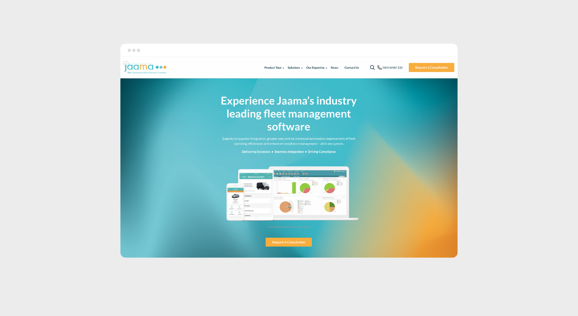
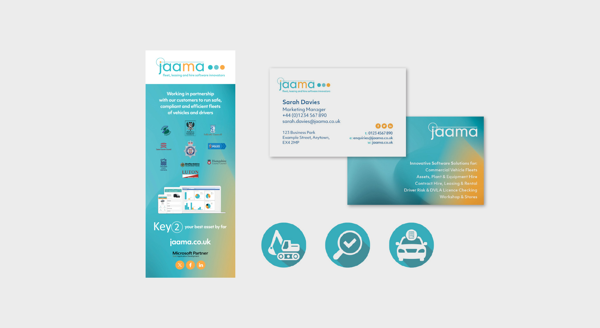
Their visuals felt dated and complicated, with heavy gradients, cluttered screenshots, and a lack of warmth. Jaama didn’t want to start from scratch, but they knew their brand needed a refresh that better reflected their strengths today.
Our Approach
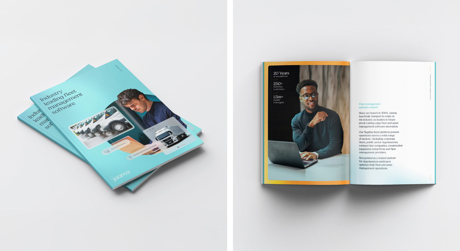
We set out to create an identity that was clear, approachable, and different from the rest of the industry. Instead of following the same overcomplicated tech tropes, we elevated Jaama’s most distinctive brand assets: their recognisable orange and blue, their logo, and their focus on people.
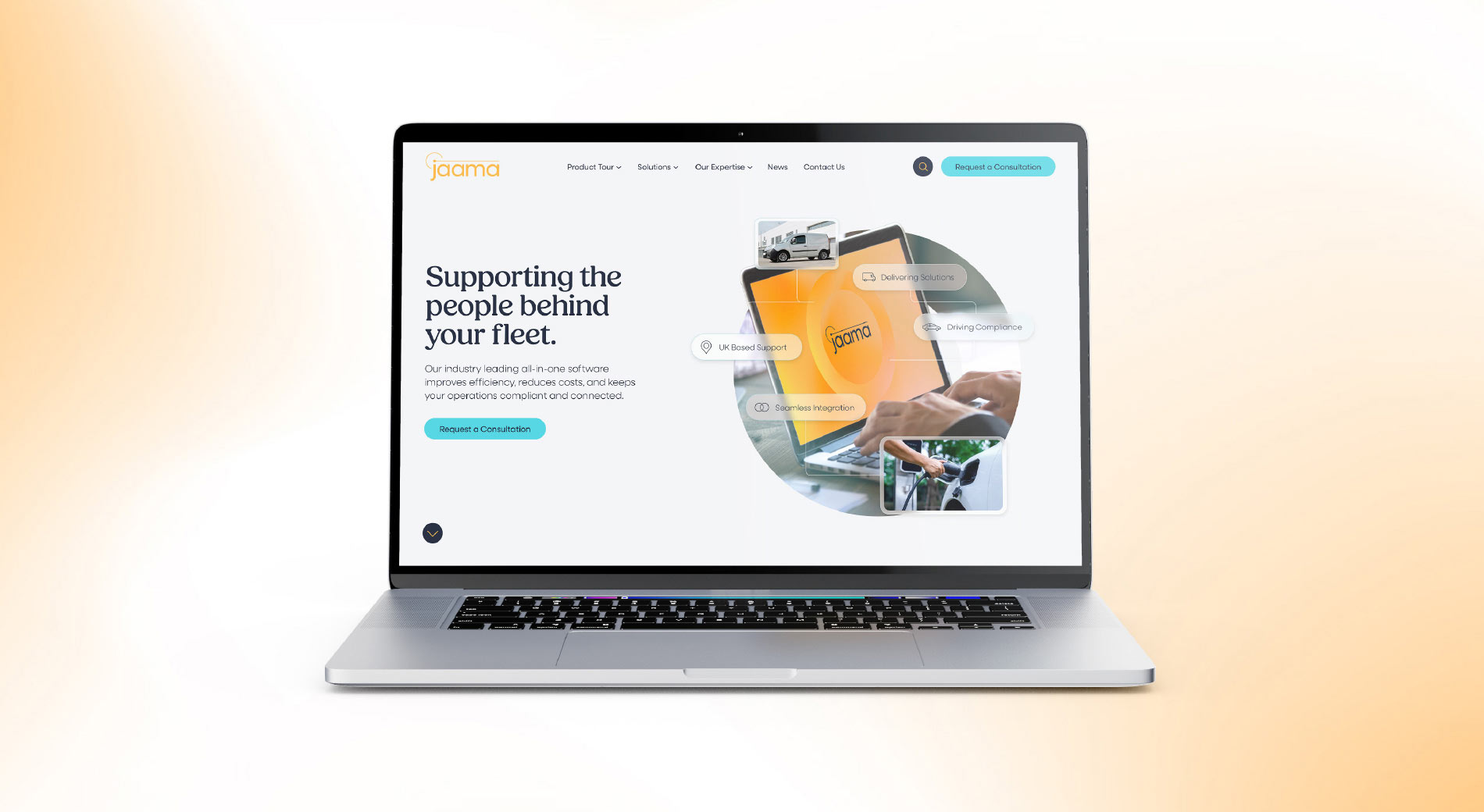
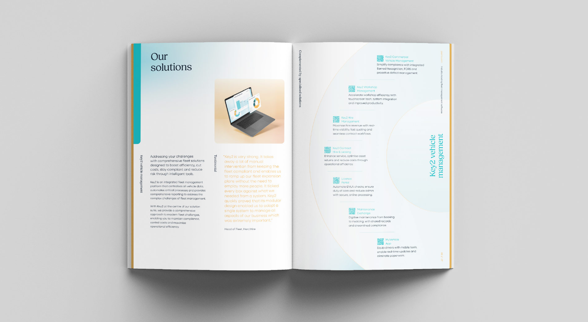
We introduced a more open and confident look, replacing busy screenshots with simple, software inspired lozenges to highlight the real benefits of the platform. The colour palette was brightened and refined, bringing more energy and optimism while keeping what made Jaama instantly recognisable.
Collaboration
Working closely with Jaama’s marketing team, we ensured the refreshed identity respected their existing brand while creating space for clearer, more engaging communication.
The Outcome
The result is a modern identity that feels both professional and human. By building on Jaama’s strengths rather than reinventing them, we delivered a distinctive visual language that reflects their software, expertise, and customer first approach, giving them a stronger voice in a competitive market.
Reflection
This project shows how a thoughtful evolution can have real impact. By simplifying and refreshing the brand, we helped Jaama stand out without losing the equity they had already built.








 Back to the Top